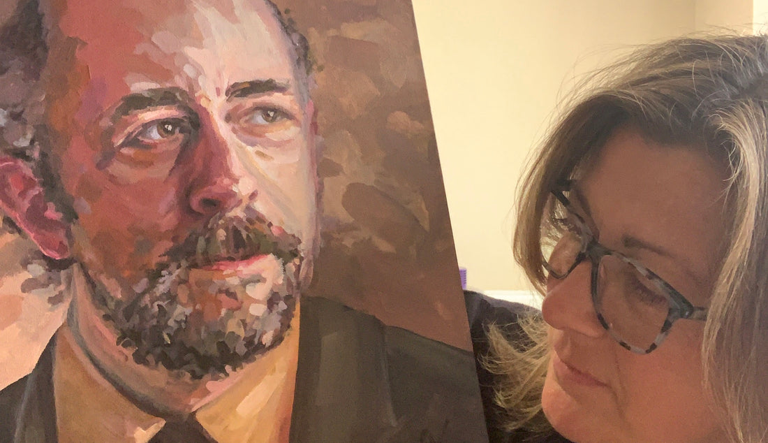
I needed a face. A face I liked. A face I was happy looking at for 8 hours. Enter stage left, my second favourite character from The West Wing - Toby Ziegler, played by the great Richard Schiff.
Why The West Wing?
The West Wing is my comfort blanket, my macaroni cheese on a cold day. It makes me feel warm and fuzzy and reminds me that there are good people trying to do their best to make things a bit better. As President Bartlet once said, "never doubt that a small group of thoughtful individuals can change the world."
A few years ago, I painted the boss himself, President Bartlet. He hangs on my gallery wall on the stairway and if he's lucky he gets a little salute in the mornings.

I might work my way down the cast list in order of preference, in which case C.J. Cregg would be next. To nobody's surprise, there will be no Mandy.
Why Toby?
There's so much to like about Toby. He's witty and prickly and sad. To me, he seems to be the most optimistic and idealistic out of the staffers, although you'd never know it by his face or indeed his words for that matter. I guess it must be his actions that let you see beyond the spikes.

Starting Off
I'm really interested in the process of creating, and I appreciate it when artists share their thoughts and processes. So here are mine:
- Find a good reference photo online. I knew I wanted a lot of contrast in light and shade. This fits my style of working as I like to find and push the colours.
- Pick a canvas (280mm x 350mm).
- Identify some colours I might have trouble mixing and create swatches from the photo.
- Crop the photo to canvas size and print.
- Grid the photo and canvas (25mm).
- Sketch the portrait in pencil onto the canvas.

Picking a Palette
Not only was Toby Ziegler - with his dour face and brown suit - born for the Zorn palette, it happens to be the palette that I have had the most success using. Traditionally, a Zorn palette (used by Anders Zorn, 1860-1920) would use only four colors: red, yellow ochre, white, and ivory black. I did introduce ultramarine blue to my palette as the black I used was mars black, which has a more reddish quality rather than the bluish nature of ivory black. The addition of ultramarine blue helped combat this.

Putting Paint to Canvas
I always plan to take plenty of process photos, but I get so engrossed and forget. So here are the few times I remembered to pause and snap my progress. I started at 2pm and finished at 10pm.


What Have I Learned?
While I prefer to complete a painting in one sitting if possible, I've learned that tweaks are sometimes needed and that I can trust myself to come back to a painting the next day with fresh eyes and not screw it up. I mixed up a small amount of paint and reworked a tiny area that had been bugging me. This has given me a bit more confidence going forward.
I've also learned that fluid retarder helps acrylics feel more like oil paints. Which means when I mix a bunch of flesh tones that I am happy with, they stand a chance of lasting the whole sitting rather than drying out.

Want to know more about all things West Wing?
Watch all episodes of The West Wing on Channel 4
Follow Richard Schiff on Instagram
Take a look at Aaron Sorkins' brilliant screen writing course on Masterclass - I've completed the course and really enjoyed it. I've not written anything decent (yet) but don't let that put you off.
Listen to the podcast The West Wing Weekly
Buy the book What's Next

Thanks for getting this far. If you have any questions about my work then please get in touch. You can use my contact form or message me over on Instagram. Let’s spread the creative love.